California Institute of the Arts
TexMex Addis is a Mexican-Ethiopian restaurant concept website designed to offer customizable menu selections with an intuitive checkout process in order for busy and adventurous restaurant-goers or at-home foodies to have a seamless and positive experience that doesn’t distract from the unique meals.
I was the sole designer responsible for the content strategy, user research, producing wireframes, hi-fi mockups and conducting usability tests. Additionally, I created the website brand identity, custom logomark, copy, image editing and retouching.
OVERVIEW
Currently, custom menu ordering processes are often complicated and may not clearly communicate the steps to users.
This makes for a frustrating user experience and also affects the restaurant’s business.
As a solution, I created a streamlined custom order flow informed from strategy developed through user research that allows users to fully review each step of the custom order structure and skip select steps if they choose to do so.
SCOPE & CONSTRAINTS
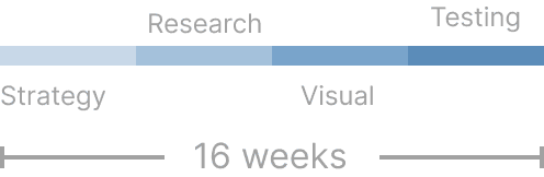
As the main aspect of the UI/UX Design Specialization certificate program, this project took
16 weeks to complete. This time period consisted of goal-setting, understanding the user, structuring content, developing interactive sequences, developing a brand identity and creating the final prototype deliverable. The Product Managers helped me better understand the context and course-correct whenever ambiguity arose, in order to best address the users’ pain points.
THE USERS
From the user research conducted, I created three distinct user personas (first-time visitors, regular customers, online food enthusiasts).
Their needs, goals, and pain points when visiting the restaurant website
Business Needs
The restaurant wants customers to have a pleasurable ordering experience, enjoy the food and return again.
User Needs
Want to discover new restaurants that are affordable, have the ability to order online and offer quick service.
CONTEXT & NEEDS
Having an inviting, easy-to-use ordering system would add to the overall restaurant experience and meet user needs while helping the business meet theirs.
If users want to order a custom menu item, the process entails a sequence that isn’t logical and can potentially have gaps in the flow. This makes for a confusing and frustrating user experience where customers may not even complete their order, which is why prioritizing simplicity in the information architecture and testing the iterations will allow users to quickly complete their goals with ease.
INFORMATION ARCHITECTURE
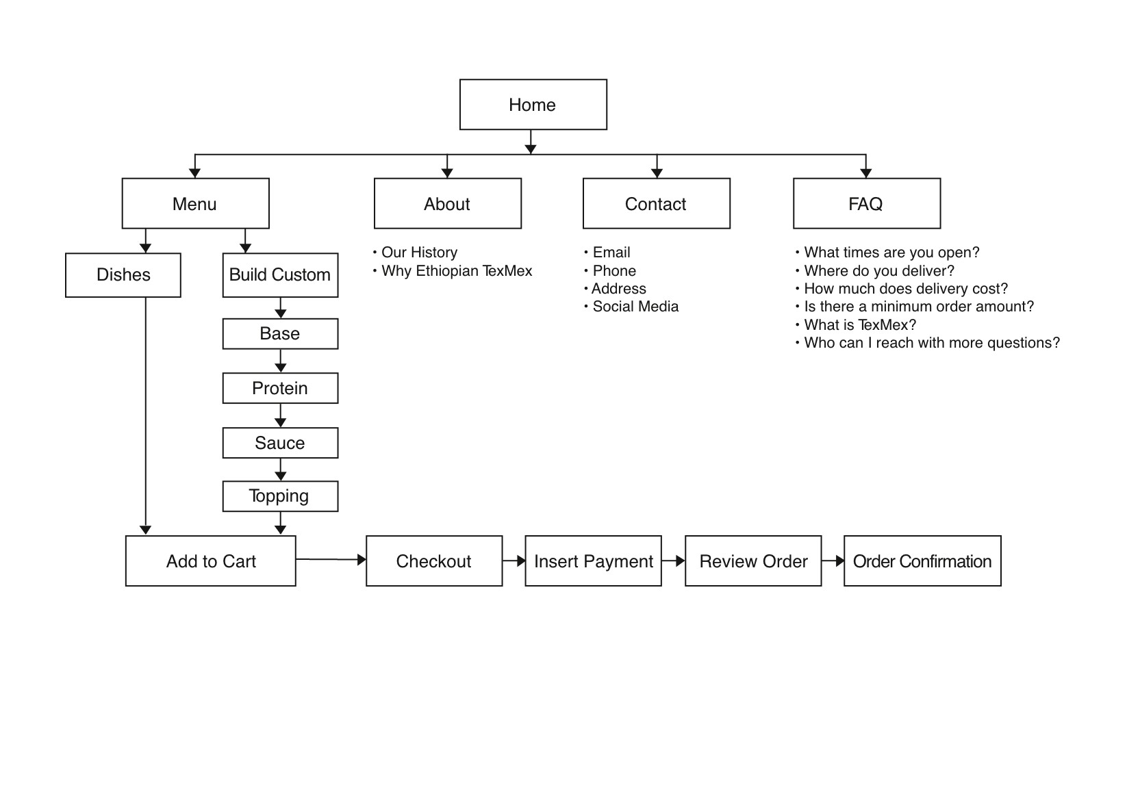
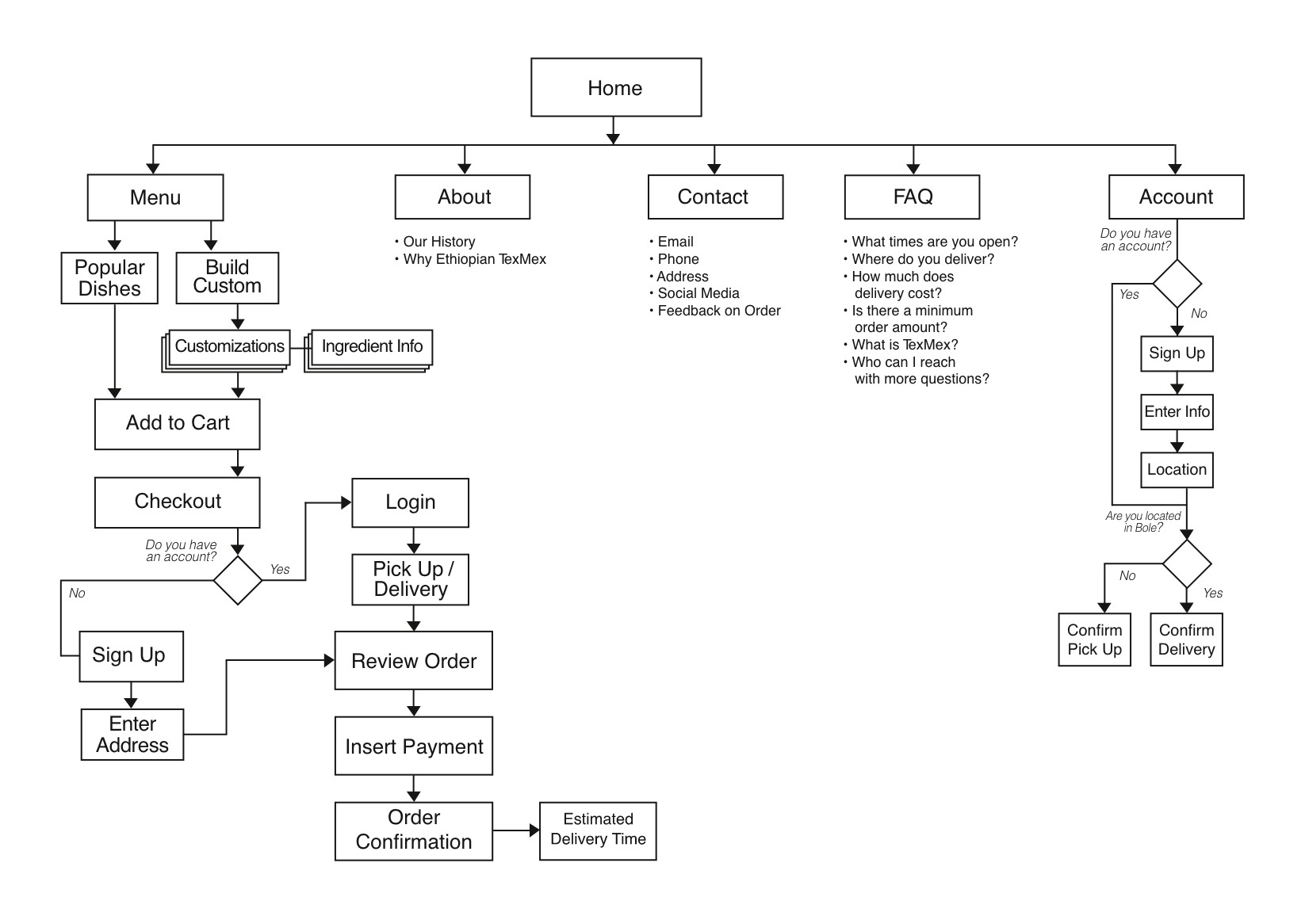
In about 8 weeks, the concept, strategy, user personas, business and client needs were mapped out and the sitemap was developed. During the sitemap process, there were several iterations as instances of gaps with user accounts and the checkout sequence were uncovered.
Every step of the way prioritized the user experience, ensuring the design remained both lightweight and intuitive.
The first iterations of the sitemap list out the core pages and the subpages in the custom order and checkout flows.
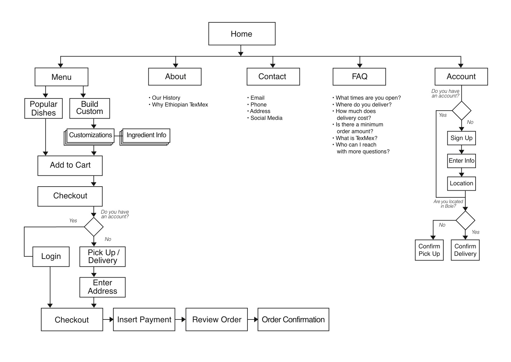
The final sitemap addresses these issues and fills out the gaps uncovered from the previous rounds.
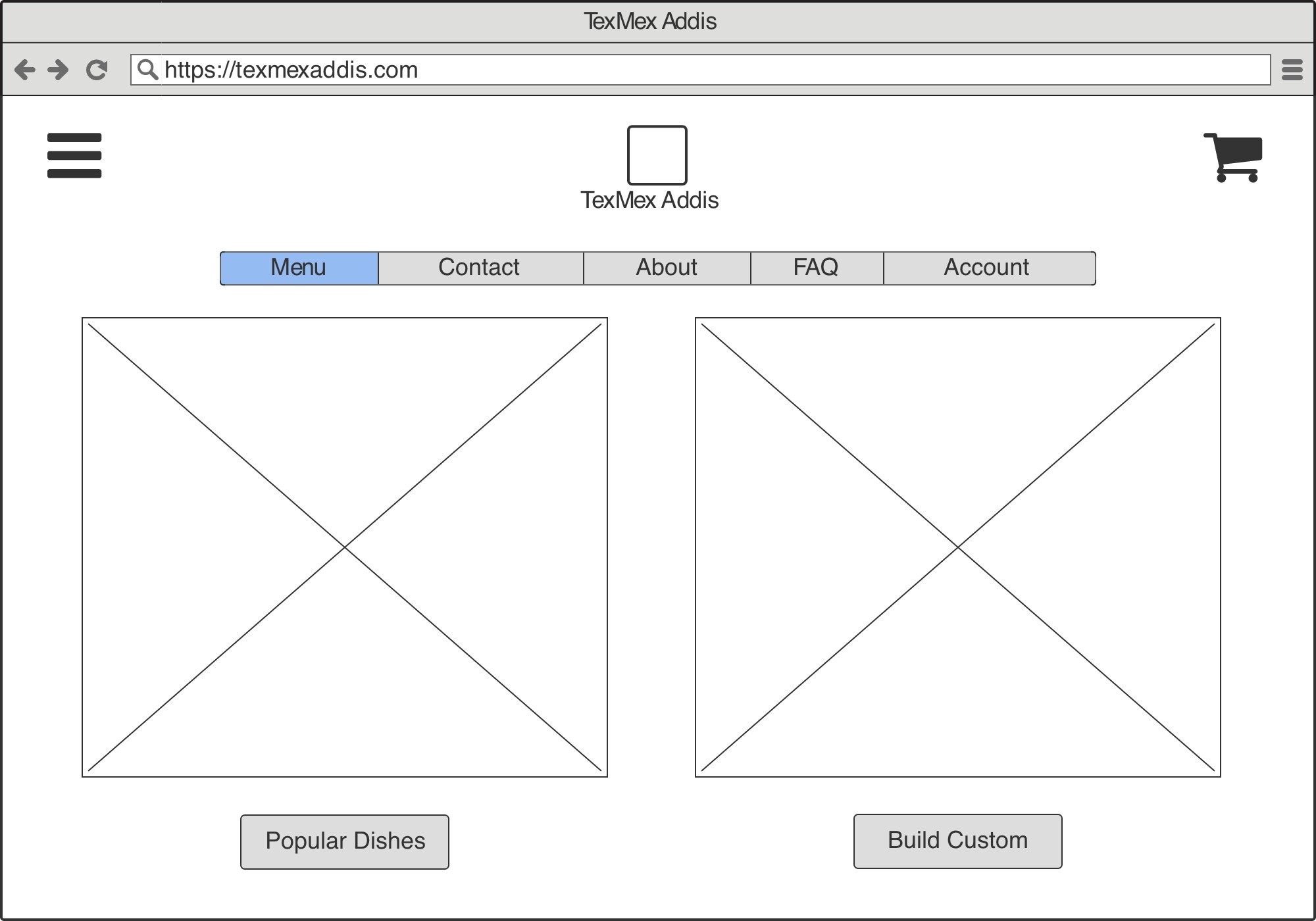
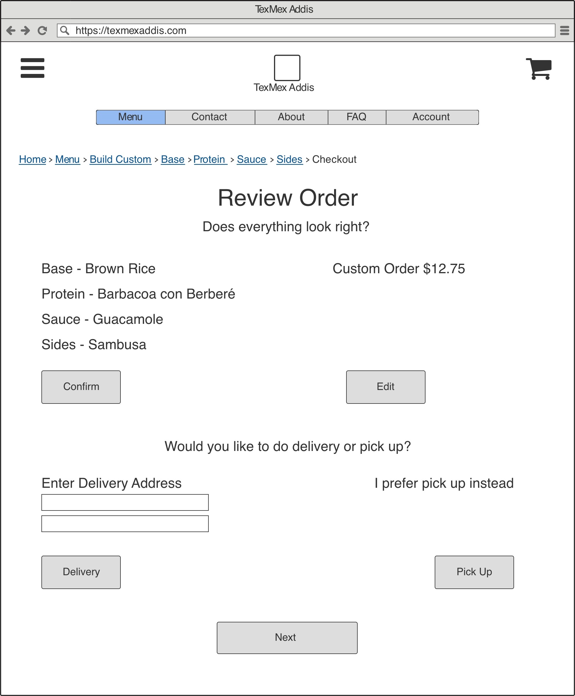
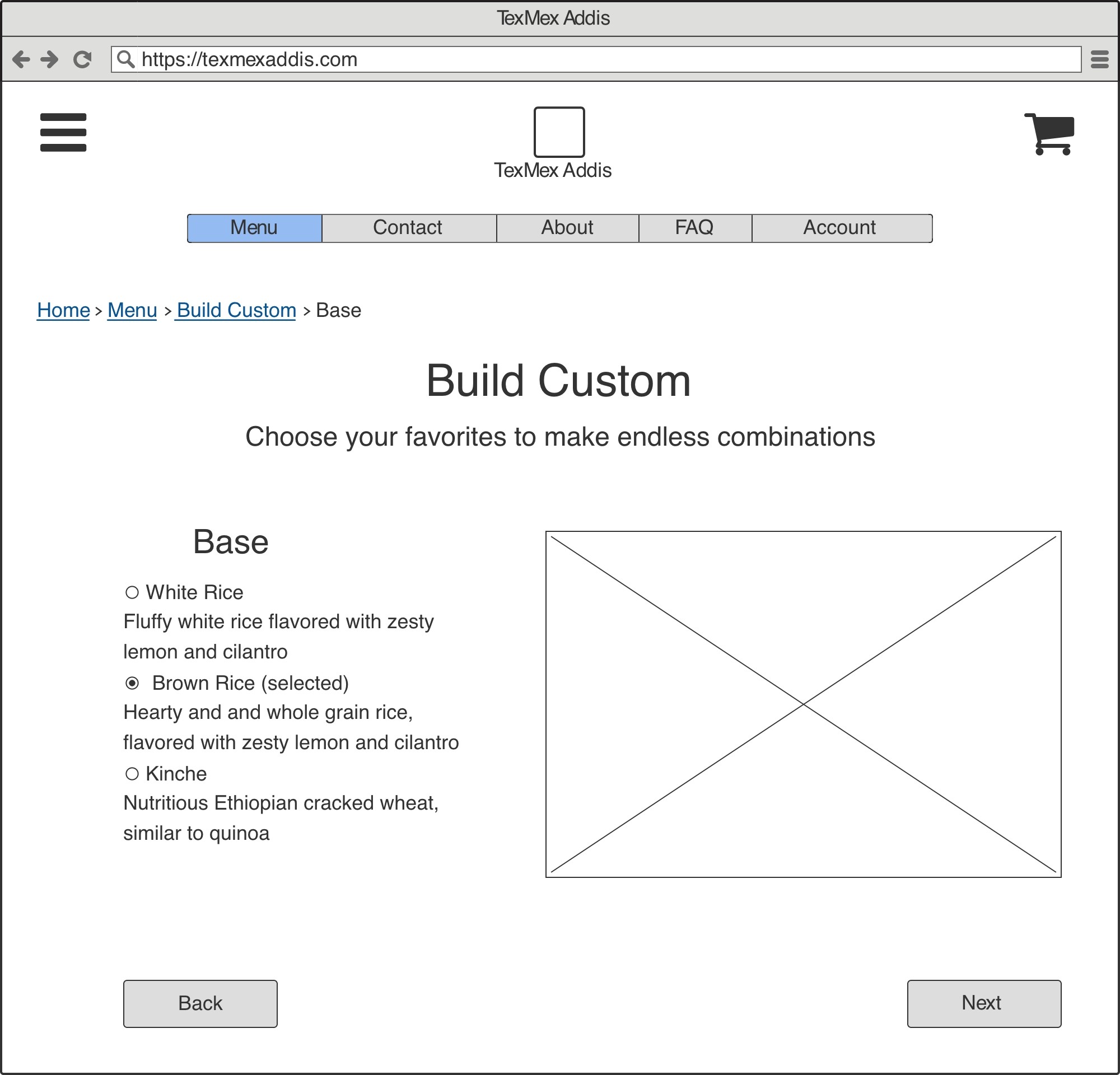
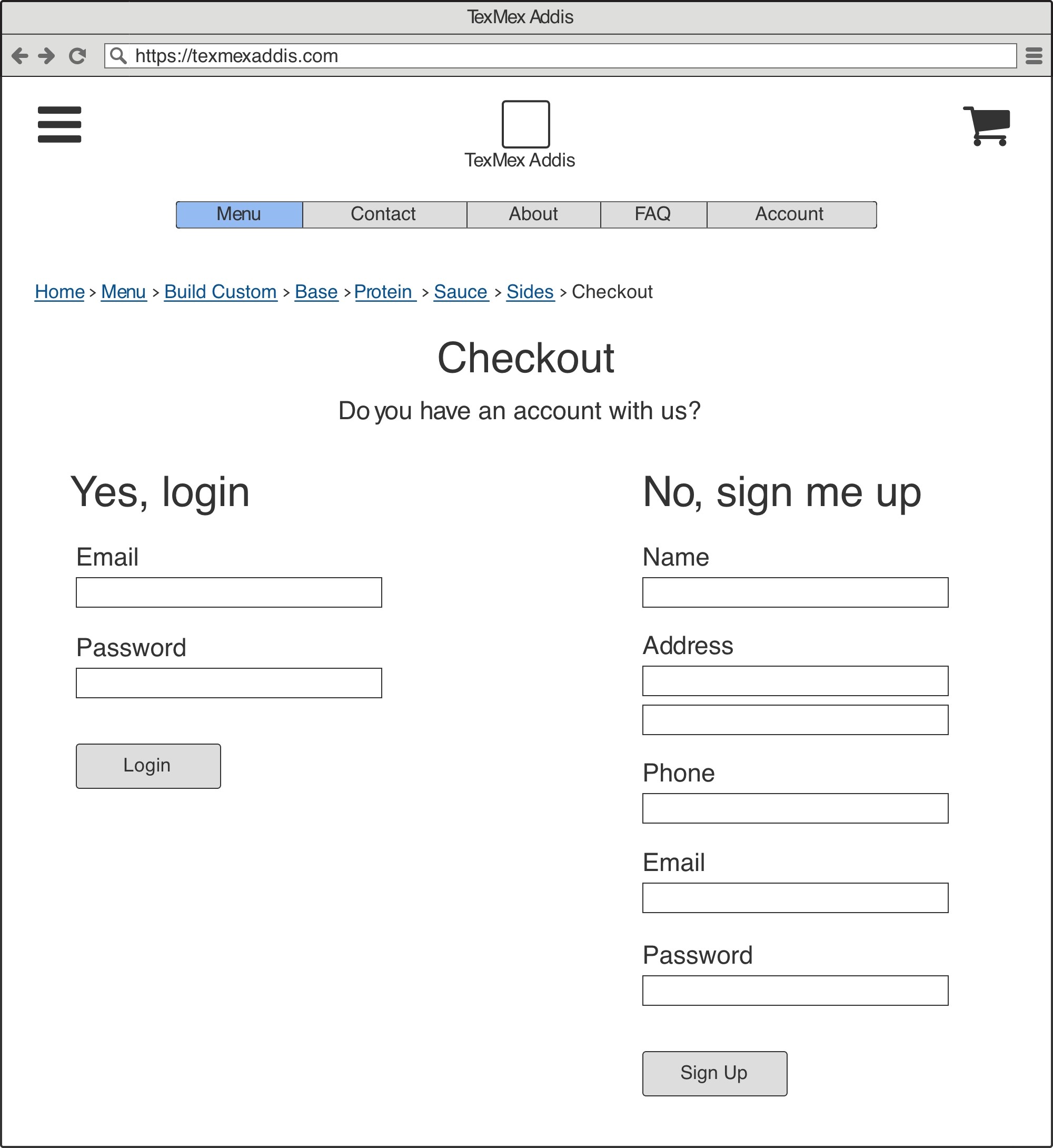
By this point, the wireframes were developed in Balsamiq after sketching some quick low-fidelity iterations with pen and paper.
The wireframes also went through rounds of iteration, especially on the custom menu item layout and sequence.
FINAL DESIGN
In about 13 weeks, the challenge facing the users was delineated, scoped, and tackled with the iterative design approach.
The video below offers a walkthrough of the site design and user flow of the custom order functionality.
WHAT I LEARNED
This project has received great feedback from the reviewers (my classmates) and from the Product Manager (the Instructor), all of which have been implemented.
While thinking back on the journey, there were a few pivotal learning moments that struck out to me, and they are:
01
User-Centric Design is Iterative
Acknowledging that user needs evolve, I embraced the iterative nature of design. Regular feedback enabled me to adapt my approach, ensuring the final product remained aligned with user expectations.
02
Consistency Builds Trust
Consistency in design elements, language, and UI layouts is a key factor in building user trust. Establishing a cohesive visual language across the platform helped foster a sense of familiarity and ease of use.
03
Onboarding is a Crucial Touchpoint
Through feedback analysis, I identified the onboarding experience as a pivotal moment in user engagement. Streamlining that flow and providing clear guidance significantly contributed to user satisfaction and retention.
04
Balancing Newness and Familiarity
Striking a balance between new features and maintaining a sense of familiarity was crucial since abrupt changes can lead to resistance. Gradual introductions and clear communication about new features ensured a seamless transition for the user base.