Harvard Extension School
I collaborated closely with the interviewees and was under the guidance of the Product Managers (the Professor and TAs) throughout the process. I was the sole designer responsible for the user research, producing wireframes, hi-fidelity mockups and conducting usability tests.
OVERVIEW
Currently, users can go on a whale watching trip and not see a single whale, plus the long rides to the whale sanctuaries are often boring with not much to see.
Having these issues unaddressed makes for a disappointing whale watching experience and also affects the tour company’s satisfaction ratings.
SCOPE & CONSTRAINTS
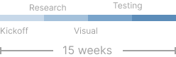
As this project is the main aspect of the User Experience Engineering course, there were 15 weeks allotted to roadmap, jump into researching the target audience demographic information and go through each step of the UX process up until the final prototype deliverable. The Product Managers helped me better understand the context and course-correct whenever ambiguity arose, in order to best address the users’ pain points.
THE USERS
Research shows that the majority of the whale watching demographic is middle-aged women who have a passion for nature and whales, specifically.
They want to see them as much as possible, and support organizations that work to protect them.
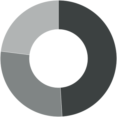
49% are aged 40 - 64
28% are aged 20 - 40
23% are listed as 'other'
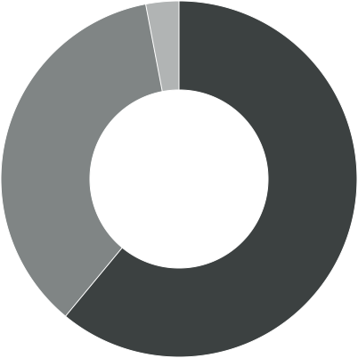
61% identified as women
36% identified as men
3% are listed as 'other'
CONTEXT & NEEDS
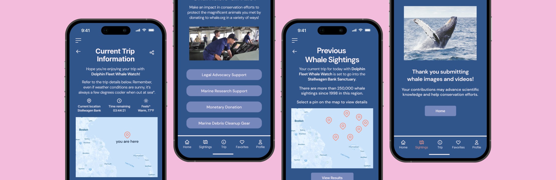
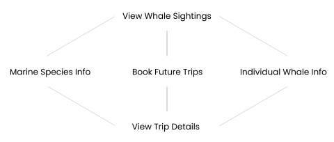
Having a dedicated ‘whale’ app would help users track key data and prepare for their trip, in addition to serving as their dedicated whale learning and inspiration space.
Users have a disjointed trip preparation and the moments of the most inspiration to support orgs or learn more aren’t capitalized on during or right after the whale watching trip, which is why maintaining the whale excitement momentum by addressing curiosity from the trip as they come up is important.
FINAL DESIGN
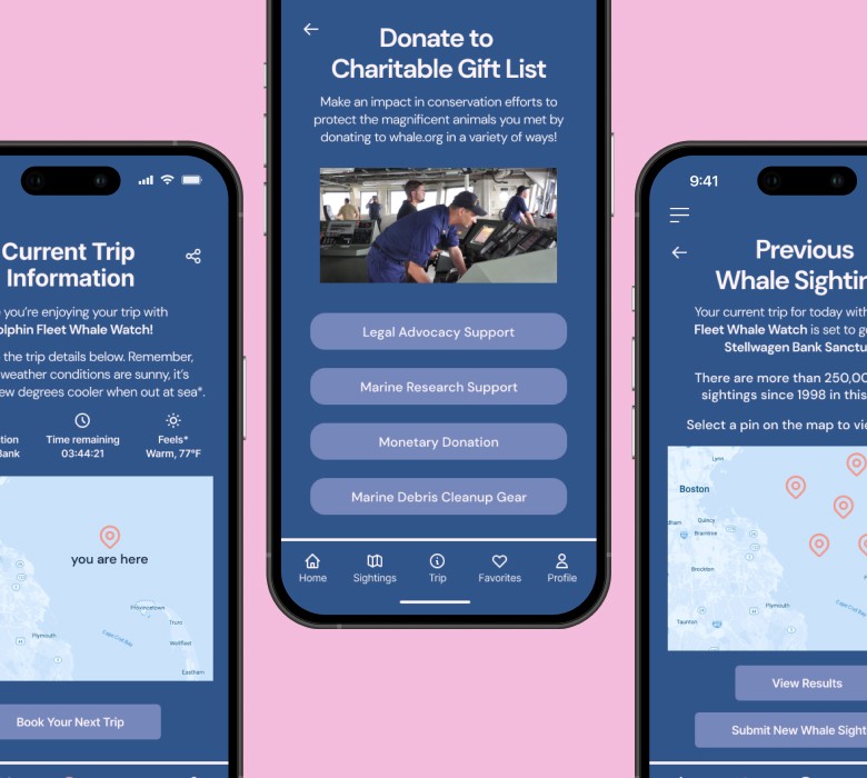
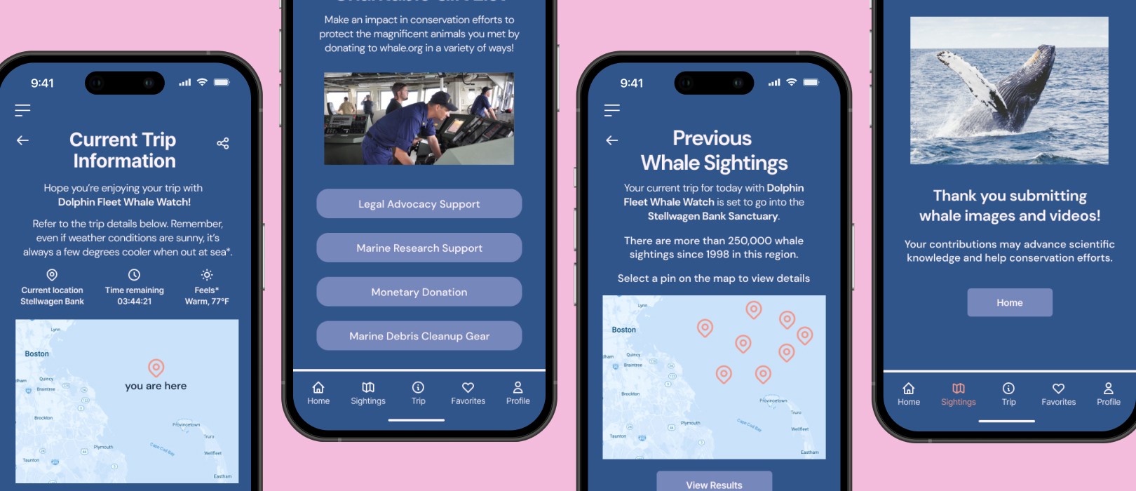
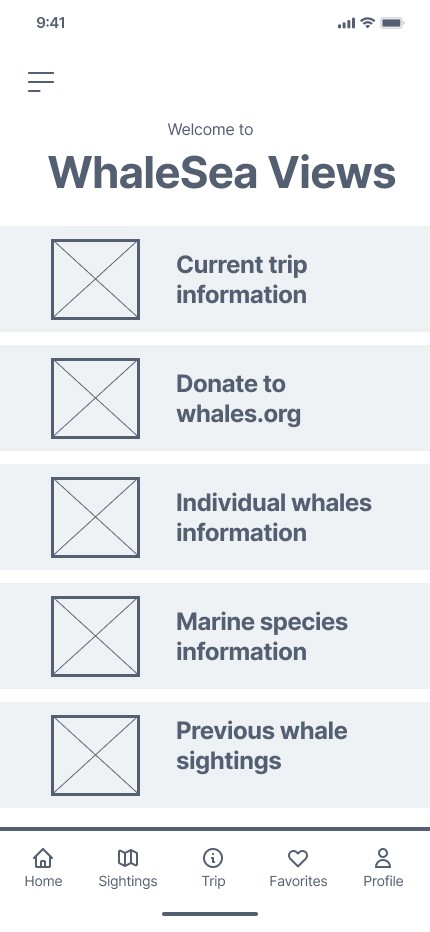
Some of the main screens include the home screen where the major aspects of the app are accessed.
In about 13 weeks, the challenge facing the users was delineated, scoped, and tackled with the iterative design approach.
Every step of the way prioritized the user experience, ensuring the design remained both lightweight and intuitive.
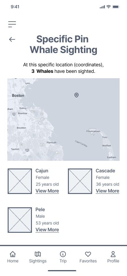
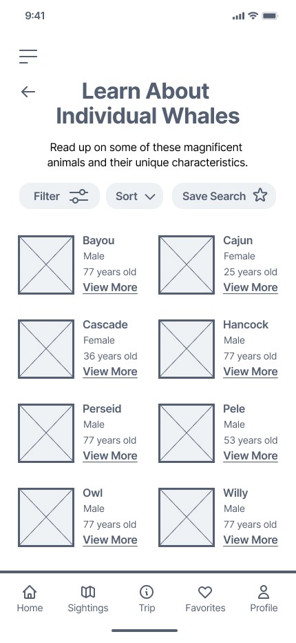
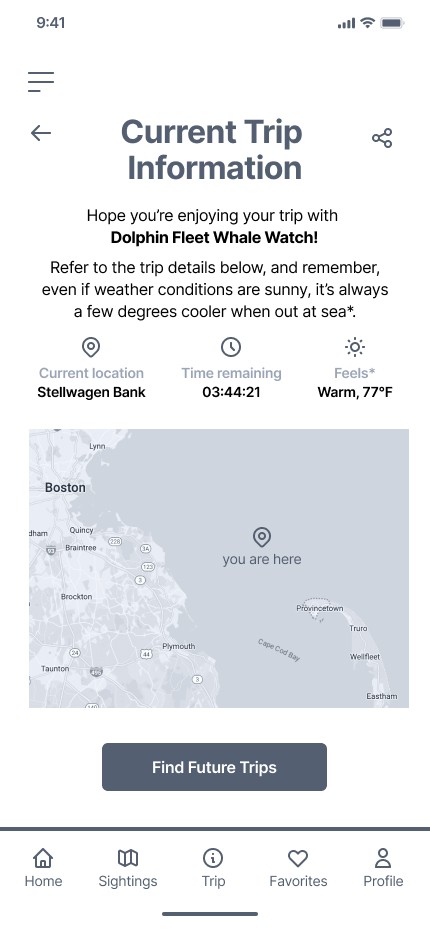
WHAT I LEARNED
This project has received great feedback from the interviewees, my classmates and from the Product Managers (the Professor and TAs), all of which have been implemented.
While thinking back on the journey, there were a few pivotal learning moments that struck out to me, and they are:
01
Target Actual User Needs
Eliminating assumptions by ensuring the right problems were being solved for via interviewing users and uncovering any unforeseen needs.
02
Ask Questions
Speaking up and asking clarifying questions to familiarize myself with the product played a big role in avoiding design pitfalls later on.
03
Embrace Challenges
In the process, there were times I wasn’t sure what direction to take. Leaning on my team and being resourceful allowed me to get unstuck and tackle issues head on.
04
Feedback is Everything
The insights I got from the interviewees across various steps of the process helped me redirect aspects of the product that were not truly serving the user.